Diner (project 1):
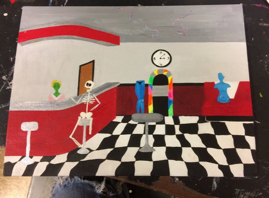
I painted the acrylic After Hours piece in about a month (several weeks too long), using a monochromatic palette with neon accents. The diner is proportionally set up to guide the viewer’s eyes towards a jukebox by the bar, supported by a warped black-and-white tile floor, which contrasts starkly against the cherry-colored bar and booth. The clock - above the accenting jukebox and below the accenting ceiling lights - reads about 3:05 which lends to the title, and the occupants’ habitation. The patrons include a skeleton and dismembered, nude blue woman, tended to by an alien waitress with blond hair. none of the occupants would be socially accepted if they were out during daylight. i guess, in a way, it expresses discrimination by appearance socially: stigmas. The most prevalent elements and principles are contrast and color, which were used side by side to create emphasis. the colors - white, black, gray, red - are very severe and create a chilly ambiance; everything feels very impersonal.
my end goal was to create a spooky diner that felt full of life, but i did not reach this goal. also a dislike, i lacked the skill to fill the allotted space, so the painting looked very empty and incomplete. my favorite portion of the painting, however, is probably what saves it from looking completely hideos: the checkered floor. the floor took a surprisingly long time, but the finished product is fun and quirky.

|
|
Witch (project two):
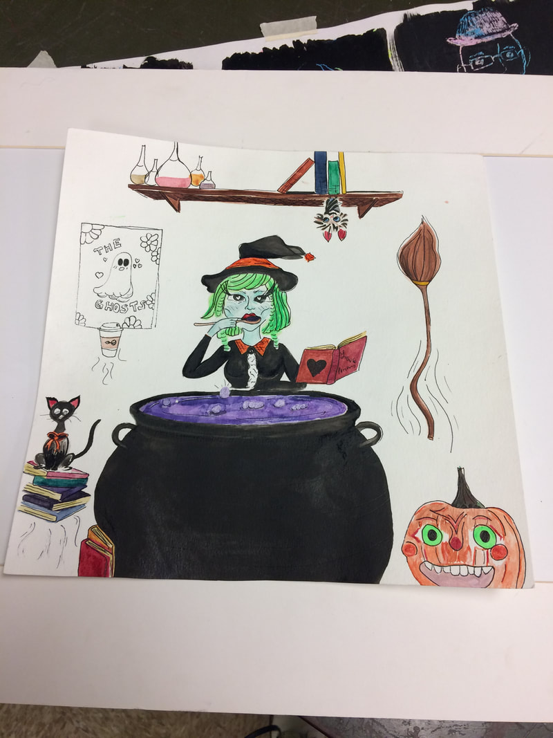
The witch was my comeback piece following the acrylic painting, and took a relatively short amount of time to complete thanks to my previous knowledge of watercolor. small in size, the painting portrays a teal-tinted witch taste testing a purple potion out of a large black cauldron, surrounding her looks to be a workshop. it’s implied that the witch is a young adult, with a band poster on the wall and coffee cup hovering to her right. the most identifiable elements and principles are color and line, the watercolor surreal, but the inkpen created a contour of the objects’ shapes, as well as suggesting levitation.
the piece itself doesn’t convey any issues, unless you’re advocating for the use of trial and error. however, curiosity is a large portion of the piece (between the witch inspecting the brew, and the viewer having to look closer to what’s strewn across her room), most features murky in a cartoonish art style inspired by the illustrator Ilse Valfre. My favorite part of this piece was deciding how much detail i wanted to provide, and how much i could leave out (and still have viewers be able to identify what the object was). my least favorite part was when my aqua-brush was being a jerk.
|
|
voodoo doll (project four):
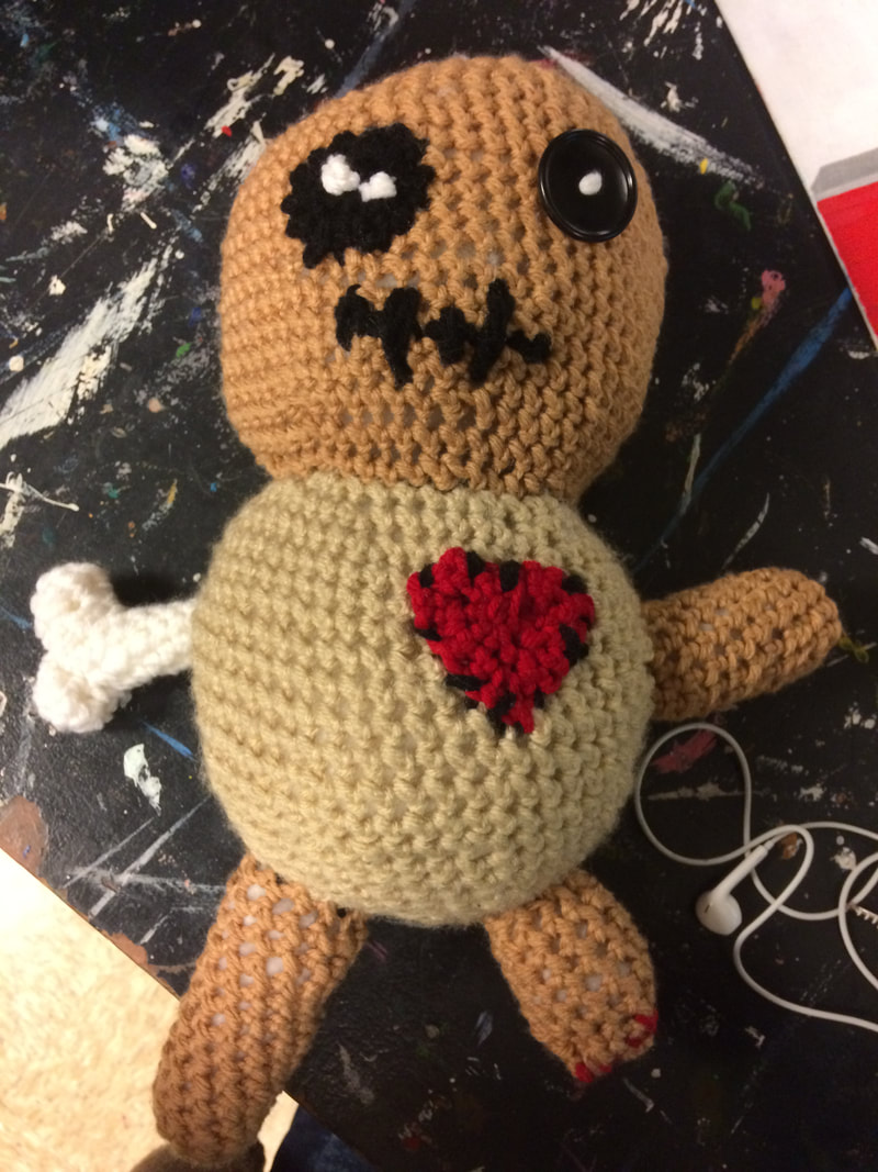
The voodoo doll is inspired by the movie princess and the frog, named after my mortal nemesis, muhammad. he drops my produce. I created the voodoo doll with crochet acrylic yarn, polyester stuffing, and buttons. there are really no issues presented, other than maybe my aggression.
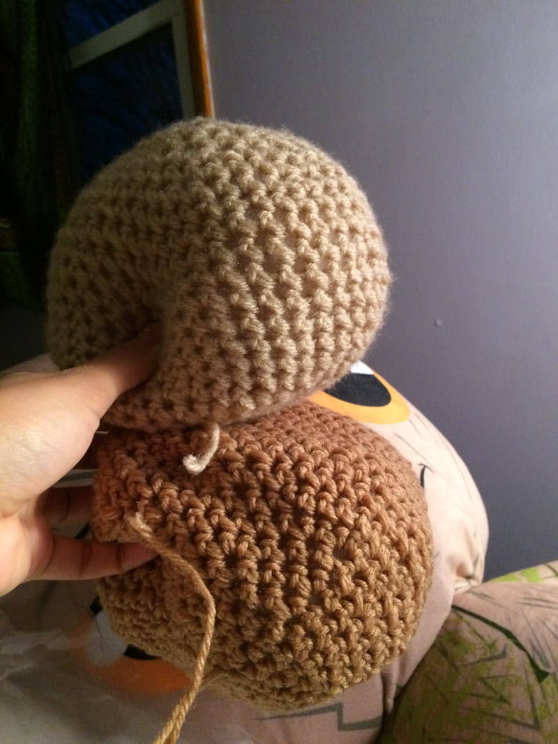
My goals were to create multiple spheres and connect them, semi-seamlessly. Thankfully, the goal was moderately successful -- i connected each of the pieces with a whipstitch technique that weaved the pieces together without revealing the stitch.
The voodoo doll is inspired by the movie princess and the frog, named after my mortal nemesis, muhammad. he drops my produce. I created the voodoo doll with crochet acrylic yarn, polyester stuffing, and buttons. there are really no issues presented, other than maybe my aggression.
My goals were to create multiple spheres and connect them, semi-seamlessly. Thankfully, the goal was moderately successful -- i connected each of the pieces with a whipstitch technique that weaved the pieces together without revealing the stitch.
